Tag Archive for: analysis

Short-Term Noise Can Lead to Long-Term Opportunity

Key Summary:

  • Markets have more noise and volatility than ever before.
  • The best forward returns happen when we build bigger positions in noisy periods.
  • Being a contrarian when fear, uncertainty, and panic has historically paid handsomely.

Very Important thesis: If equities generate roughly ~10-11% a year over time, the best companies with leading brands and dominant global franchises, in theory, should compound at 13-15%+ over time. Looking backward, that is exactly what’s happened. Our best opportunity as an investor: buy more great brands when the market acts irrationally short-term. Your long-term returns will thank you.

Today’s Short-term Noise Won’t Last Forever.

With so much fear, uncertainty, and doubt (FUD) in markets and the economy today, I thought I would try and turn this frown upside down using some contrarian thinking. I’ve been an investor for 30 years now, so I’ve seen a lot of different kinds of markets. Between the Internet boom and bust, to the raging housing boom and crash during the GFC to the Covid crash and money printing experiment that created the interest rate and inflationary “normalization” process, the ride has been a wild one. During times like today, it’s important to remember that the short periods of FUD, like hurricanes, don’t generally last very long and when the uncertainty starts to wane, stocks and animal spirits wake up in a big way. It’s only a matter of time.

If you only take one thing from today’s musing, take this: storms are a sideshow to sunnier days. Markets go up 80-85% of the time so it’s in the down periods that we get an opportunity to buy great merchandise on sale so when the sun comes out again, you’ll own more quality and your speed to recovery gets accelerated.

Pessimism is Everywhere. Contrarian Signal?

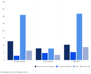
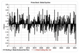
We live in very interesting times. Tariff announcements are happening daily. Self-induced cracks in the economy are developing. Friction is developing between U.S. politicians and our allies. This is a moment in time and cooler heads will prevail in time. Clearly, the market is sniffing out a slowing of economic growth coming from policy uncertainty. While deep selloffs never feel good, this one in particular feels quite extreme because investors of all kinds have simply decided to “step-away” from markets until some certainty re-appears. The selling has been persistent because it’s a 1-sided market for now. Buyers are on strike, sellers and shorts are bold. Need proof? The below chart from Goldman Sachs shows how severe the de-risking has been in a short period of time. Hedge Funds, CTA’s, systematic investors and even regular retail investors, have all been selling due to high bouts of uncertainty.

With few buyers on the other side, the market just drifts lower, and rallies get sold quickly. Imagine what markets will do if/when there is some better policy certainty, consumers and businesses have a better understanding of the rules of the road and earnings variability stabilizes. Sellers will dry up. Shorts will cover. Animal spirits will return with a vengeance. There will be a lot of buyers all rushing back at once. I suggest we all start building bigger positions so when the party heats up, we have a great seat.

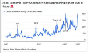
To give you a sense how severe the policy uncertainty is today, the chart below shows an index that measures it. We are higher than any other period over the last 25 years. Kind of incredible really, there were some scary moments in these former spikes. There were some great buying opportunities then too, and they all felt terrible at the time.

To Reiterate:

“De-risked” is not a permanent state. At some point, when either A) markets sell-off to a level where sellers feel like the doom is fully reflected in prices, or B) situations are getting better on a rate of change basis, or C) the major drivers of vol and downside begin to vanish, there’s going to be a complete reversal of the de-risking as re-risking happens all at once. We never know the WHEN, but we do know investors will not stay de-risked forever.

This is not a complex concept but emotionally, it’s often difficult to execute. Trying to pick bottoms is a tricky business, particularly given every day we see a rash of new headlines that algorithms love to trade against. Be systematic about adding exposures to your favorite strategies on deep red days. Do not buy all at once, split your buy orders up and build these positions while the pessimism is incredibly high, and prices are attractive. Remember, volatility and opportunity are neighbors!

Pessimism is Everywhere & It’s at an Extreme.

I cannot tell you when cooler heads will prevail, just that they will one day. I’m sure you have seen all the charts and data showing how cautious and outright pessimistic investors, small businesses and even corporations are becoming. It’s a dangerous game our leaders are playing but the stakes are quite high if they push this too far. Therefore, we should expect they understand the risks too and will manage them accordingly. Here’s a few examples showing the FUD today.

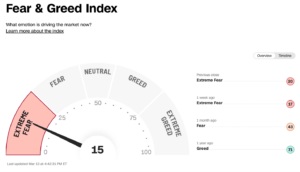
The CNN Fear & Greed Index: Current Reading, Extreme Fear.

This indicator measures 7 important indicators and rolls them into a score. It’s a very low number today, historically a decent spot to start adding to stocks if you have some time. Like most sentiment indicators, only at extremes are they useful as a timing tool.

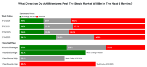
AAII Sentiment Survey: Current Reading, Extreme Bearishness.

This survey has been around for many decades. It helps to measure how positive or negative investors are, likely biased by current market activity. At the extremes, this bearish view has tended to be a wonderful contrarian buy signal.  It’s very rare to see 60% bearishness and <20% bullishness. Historically, these periods offered solid forward returns. Again, having time is important, things can always get more extreme before they get a lot better.

Stock Breadth Washout Signals

One of the ways we measure washouts is knowing what % of the stocks in the S&P 500 and Nasdaq are currently trading above the 20-day moving average. Generally, if under 20% of stocks are trading over the 20day, there’s a decent buying opportunity. Sometimes, volatility and uncertainty are so high, breadth can get fully washed out. I expect that to happen in today’s climate as no end in sight seems visible for these tariff and economic slowdown possibilities The current situation feels a lot like Q4 2018 to me and breadth got to <5% on the Christmas eve low. If we see this kind of extreme reading again in the next month or two, close your eyes and buy some quality stocks, we certainly will with eyes wide open.

Today, March 14, 17% of stocks are trading above this short-term moving average. AKA, we could have more selling until we get fully washed out if politicians keep pushing this odd approach.

Bottom line.

On a day-to-day basis, markets can be volatile. News headlines, earnings, political actions, and plenty of other items can whip-saw our portfolios. The more short-term term we focus, the more angst we can generate. Angst puts pressure on our emotions and emotions make us make irrational decisions. The best advice I can give anyone who invests is this: If you try to wire your brain to be opportunistic when the masses are filled with fear and be cautious when others have euphoria, you will become a very good investor.  Over the long-term, your portfolio will look like the green line, in short periods of time, it can look like the yellow line. Today we focus on yellow, but do not lose sight of the green!

Important Disclosure: The above data is for illustrative purposes only.  This information was produced by Accuvest and the opinions expressed are those of the author as of the date of writing and are subject to change. Any research is based on the author’s proprietary research and analysis of global markets and investing. The information and/or analysis presented have been compiled or arrived at from sources believed to be reliable, however the author does not make any representation as their accuracy or completeness and does not accept liability for any loss arising from the use hereof. Some internally generated information may be considered theoretical in nature and is subject to inherent limitations associated therein. There are no material changes to the conditions, objectives or investment strategies of the model portfolios for the period portrayed. Any sectors or allocations referenced may or may not be represented in portfolios managed by the author, and do not represent all of the securities purchased, sold or recommended for client accounts.  The reader should not assume that any investments in sectors and markets identified or described were or will be profitable. Investing entails risks, including possible loss of principal. The use of tools cannot guarantee performance. The charts depicted within this presentation are for illustrative purposes only and are not indicative of future performance. Past performance is no guarantee of future results.

What’s the Real Value of Active Management?

Key Summary:

  • ETF’s have become the preferred investment wrapper of choice for investors.
  • The vast majority of ETF assets are passive, rules-based, & market-cap weighted.
  • Active strategies with high tracking error can add significant value to the portfolio mix.

Very Important thesis: If equities generate roughly ~10-11% a year over time, leading brands, dominant global franchises, particularly those serving the dominant driver of the economy, in theory, should compound at 13-15%+ over time. In a world where rates and inflation will likely trend higher for longer, business models with pricing power, exposure to quality factors, and that generate strong profits and free cash are set up to win versus broad markets. Brands Matter.

ETFs are the Preferred Investment Wrapper.

The data is very clear: actively managed mutual funds continue to lose assets to ETF’s. That’s the headline we all see every day. Remember, headlines are bold because they want your attention, the real story lives in the details. It makes sense that a portion of the active market is losing share to ETFs. Why pay a higher fee for a less tax efficient strategy, particularly if it’s a closet index strategy? In my opinion, true active strategies have a very important role in portfolios as complements to passive, cheap beta. Advisors need to understand what they own. Are the active funds’ benchmark huggers or do they do things very differently than the benchmark? Is there a similar strategy available in an ETF wrapper? Important: to have the chance to beat a benchmark, a strategy needs to look very different than the benchmark. The way to track this is by using Tracking Error. A high tracking error means the fund looks very different and can therefore be very valuable to a portfolio from a diversification and returns perspective. If you can get access to the themes you want and do it in a tax efficient wrapper while gaining high tracking error, congratulations, that’s valuable! Spoiler alert: that’s not easy to do, it requires a lot of research and sadly, the analytics providers do not make the research easy because they rarely look at the sector, sub-industry, and single-stock level.

In this week’s note, I’ll make the case that active deserves a place in portfolio’s along with passive ETF’s. Thank heavens there are more active ETF’s being launched because the market has been dominated by passive, rules-based, market cap weighted ETF’s (90% of ETF assets). What does that mean for a portfolio? It means more and more portfolio’s look the same and they are more tied to MOMENTUM as a style factor than ever before. That works until it doesn’t. This also means, benchmark hugging active managers are also too tethered to the momentum factor making “size and momentum” the biggest part of most portfolios.

Active, Contrarian Opportunities Are Everywhere.

Image: Created for Eric Clark by ChatGPT.

I am not saying run from passive, market-cap weighted ETF’s, I’m simply saying properly active strategies should be blended with passive, so portfolio’s get the benefit from many different style factors and exposures. As more and more “active funds” take on more passive characteristics, the value of true active strategies will grow by leaps and bounds. One area that’s likely the least crowded trade: the Consumer Discretionary, Consumer Staples, and Communication Services sectors. Our team traffics in highly relevant, high quality global brands. Many of which live in these three sectors and as you can see below, at the index level, these sectors are under-represented in a meaningful way, while a heavy tech weighting drives the returns. If the S&P 500 is the proxy investment for an allocation to the U.S. economy, and the economy is 70% household consumption, why on earth would the weighting to Consumer Discretionary & Staples be this low? We think that’s the opportunity today for investors.

I can almost guarantee your portfolio is chronically underweight the primary beneficiaries of a consumption-led economy. As you can see below, Tech holds the highest weighting across blend and growth indexes and Consumer Discretionary, Staples, and Communication Services is low. In the brands portfolio, we have 2-3x the discretionary and staples exposure, 40% more communication services and one-third the tech exposure. Our tracking error is almost 10, and this is not an accident.

What Does High Tracking Error Look Like?

To highlight the high tracking error theme, below I show a chart of the top 10 brands and the weights in the Brands portfolio relative to the S&P 500 and the Russell 1000 Growth Index. Remember, these two broad style boxes are where the bulk of the typical portfolio is allocated. In the brands strategy, we focus on the dominant global theme of household consumption and business innovation spending through the leading brands. According to the economy and business cycle, we allocate to important sub-themes through market share leaders. Here’s why the tracking error is high. We own a lot of brands that are significantly under-represented or fully absent from indexes. That’s valuable!

The Top 10 Brands in the Brands Portfolio (57% of the total):

  1. Amazon: 15% versus 3.8% (S&P 500), 6.6% (R1Growth).
  2. Apollo Global: 6% versus ,0.55% in both indexes.
  3. Netflix: 5% versus <1.2%.
  4. Live Nation: 4.9% versus essentially 0%.
  5. Blackstone: 5% versus <.50%.
  6. Chipotle: 4.9% versus <.30%.
  7. KKR: 4.9% versus <0.20%.
  8. Costco: 4.7% versus <1.5%.
  9. L’Oreal: 4.7% versus 0%.
  10. Meta: 4.6% versus <4%.

Bottom Line:

  1. If you own any active funds or ETF’s, make sure they are truly active and have high tracking error to the benchmark.
  2. Blend active and passive in a portfolio to achieve maximum diversification and return benefits.
  3. Do not ignore the winners in a consumption led global economy, these brands are wonderful businesses, have significant economic moats, generate massive profits, and always have demand for their shares when the stocks go on sale. That makes them terrific adds to a portfolio and right now, buying consumer-focused brands is likely the least crowded trade in markets.

BE A CONTRARIAN

Disclosure: The above data is for illustrative purposes only.  This information was produced by Accuvest and the opinions expressed are those of the author as of the date of writing and are subject to change. Any research is based on the author’s proprietary research and analysis of global markets and investing. The information and/or analysis presented have been compiled or arrived at from sources believed to be reliable, however the author does not make any representation as their accuracy or completeness and does not accept liability for any loss arising from the use hereof. Some internally generated information may be considered theoretical in nature and is subject to inherent limitations associated therein. There are no material changes to the conditions, objectives or investment strategies of the model portfolios for the period portrayed. Any sectors or allocations referenced may or may not be represented in portfolios managed by the author, and do not represent all of the securities purchased, sold or recommended for client accounts.  The reader should not assume that any investments in sectors and markets identified or described were or will be profitable. Investing entails risks, including possible loss of principal. The use of tools cannot guarantee performance. The charts depicted within this presentation are for illustrative purposes only and are not indicative of future performance. Past performance is no guarantee of future results.

My 50-Cents – Fed Analysis from Leland Abrams of Wynkoop, LLC

The Federal Reserve Board cut their benchmark rate this week by 50 bps to a new range of 4.75% – 5.00%.  They indicated this is the start of a rate cutting process and further cuts were coming, likely another 50 bps by year end.  The market had been pricing in an approximate 65% chance of this happening the day of the decision.  We boldly prognosticated this larger than usual rate cut more than two months ago when the market was not even fully pricing in a chance of a 25 bps cut at the September FOMC meeting.


Anyone who has observed the material weakening in the labor market coupled with quickly dropping inflation (and deflation in economically sensitive areas) in addition to the very weak observations in the Fed’s Beige Book should not have been surprised by the size of this first rate cut.  Fed Chairman Jay Powell brought up the Beige Book without being prompted when defending his rate cut during the press conference on Wednesday.  The Beige Book, a qualitative summary of business and economic activity by region, did not paint a good picture.  According to its findings, more than half of the Federal Reserve Districts are already in a recession (declining economic activity) and another quarter are experiencing stagnant growth.  This report does not jive with the Bureau of Labor Statistics’ GDP reports.  We believe the Beige Book offers a better, real-time, glimpse into what is happening on the ground with respect to the economy.  This clearly spooked Jay Powell.


We have written ad nauseum about inflation coming down and likely being lower than the reports indicate.  For example, if the U.S. used the European calculation for inflation, we would see a YoY number in the high 1%s, below the Fed target of 2%.  Economically sensitive areas are experiencing outright and accelerating deflation.  While GDP measures aggregate demand of the economy, one must look at the supply side to see where prices are going.  Aggregate supply has outstripped aggregate demand, which puts DOWNWARD pressure on prices.  Also, the commodity complex has been performing terribly despite a weaker dollar (weak dollar usually makes commodities rally).  We see little to no reason to be concerned about inflation reigniting.


The bond market was mostly ahead of the Fed’s cut and now the two are relatively in sync with each other (bond futures pricing and Fed dot plot).  We noted previously that the longer end of the curve could become stuck and we favored the front end of the curve, which still has significant room to drop.  The initial reaction to the Fed 50 bp cut was actually to see bonds selling off (an example of buy the rumor, sell the fact).  If we study the analogs of 2000/2001 and particularly 2007 (the 2-year note behavior is almost identical), we see some correction selling off (yields moving slightly higher) in the short term, only to resume a significant bull-steepening rally of the rate curve in the coming months.


We are not in the soft-landing camp.  We think the Fed was and still is behind the curve and believe it is unlikely they can arrest the deterioration in the jobs market and hence economic activity.  If history rhymes, the recession we’ve all been waiting for (and many who have given up on) may have just begun.